vrijdag 19 februari 2016

Jurassic Park: Dinosaurs 2: Electronic Brachiosaurus with Micro Stegosaurus


Year of release: 2004

Description: this Sauropod (large four legged animal with typical long neck) stands in a fairly neutral position except for the tail, which is bent to the left in an almost circular fashion, and the right front leg, which is lifted off the ground and points forward, so the dino strike action can be activated more easily. This attack feature consists of a swinging tail strike (though the figure's package seems to have put it in reverse and mentions 'stomping action', no doubt activated by pushing the tail back and forth), accompanied by a low roaring sound. A second sound can be produced by pushing the white button in the dino damage wound: when pushed, a shrieking roar can be heard, as if the creature is howling in pain. The wound is located on the right flank, and is basically a dark red spot of muscle tissue with small white bones sticking out of it. As usual for Hasbro figures, the wound cannot be covered up, but is constantly exposed. The figure’s long neck is bendable, but only slightly.
Green is this Sauropod's colour of choice. Its underside (a very long throat, the belly, and the front half of the lower part of the tail) is painted greenish beige, while the rest of the figure is covered in two different shades of green, the darker one found mostly on the top parts (neck, back, upper part of the tail, upper legs) and the lighter shade between the greenish beige and the darker green, most notably on the head, legs, end of the tail and flanks. The two shades of green gradually dissolve into one another instead of being clearly delineated. The neck, back, front half of the tail and legs sport a number of black stripes, with all of them except those on the neck featuring smaller brown stripes in their centre. The stripes are randomly applied to the creature's body. This Brachiosaurus has small black eyes, white teeth, a pink tongue, a black inside of the mouth, black claws on all toes and a big white JP logo on its right upper leg.
The miniature Stegosaurus is basically coloured in four layers. The lowest layer (the belly, throat, most of the lower jaw and underside of the tail) is painted light grey. Above that, the second layer is white, covering the legs, flanks, both sides of the faces and tail. A number of dark grey spots and stripes adorn the white parts of the figure. The top layer is coloured black, covering the creature's back, upper jaw and face, top of the tail, and most notably, the plates and tail spikes. In-between the white and black parts of the Stegosaurus there's the final layer, an orange line on either flank of the figure, running from the base of the neck to the end of the tail, ending just under the last set of plates. The eyes are yellow with black pupils and a black JP III logo can be found on its left back leg. The animal stands in an active posture, with its body bent and its tail dangerously sticking out, like it’s defending itself from an aggressor.


Analysis: you can't (and shouldn't) keep a good sculpt down, especially if it's a Sauropod because the various JP toy lines have made far too little use of those awesome beasties. Therefore, JP Dinosaurs 2 sees the return of Hasbro's Brachiosaurus sculpt. It has remained unchanged, so the neat whipping tail action, funky dinosaur sounds and somewhat bendable neck are still present, but unfortunately so are the irritating dino damage wound and awkwardly bent tail.
This Brachiosaur's paint job is a lot different that that of its predecessor. It's neither an improvement nor a disappointment, but a nice solid new paint job which fits this figure rather well. The green is dark and smooth enough to not feel ridiculously 'in-your-face' green, but a bit more natural instead. The brown stripes are a nice touch and could also be viewed as old battle scars (in which case; poor creature, to have run into so many conflicts!). Overall, this figure might also make a good Camo-Xtreme Jungle Brachiosaurus (though Brachiosaurs would probably be too big for an actual heavily forested environment in reality).
Its Stegosaurus companion is a nice little bonus, but nothing else. Though its paint job is still okay, the fact that it's a reuse instead of a repaint makes it feel like a wasted opportunity. Also, its colouration feels completely inconsistent with its bigger herbivorous counterpart: though it's nowhere stated explicitly that dinosaur paint jobs in two-packs should feel complimentary, these two paint jobs clash a little too much.
Overall, aside from the new Brachiosaurus paint job this set offers nothing new, but it's a good chance to expand your line-up of herbivores, since they're grossly outnumbered in the JP toy lines by their meat eating brethren. And of course, any fairly big Sauropod is welcome, considering this is only the second decently sized Brachiosaurus figure in 13 years of JP toys.

Repaint: yes. The Brachiosaurus was originally released in the JP III line (Wave 2). It is a first time repaint and, so far, last time repaint too. The Micro Stegosaurus is more or less identical to the figure from the Camo-Xtreme Arctic two-pack, though the paint job might feel a bit harder. This particular sculpt was originally paired with Paul Kirby in Wave 2 of the JP III line, and has since been repainted for Camo-Xtreme, JPD2 and JPD3.

Overall rating: 7/10. Not so bad a repaint set. Granted, neither sculpt is new and the Stegosaurus is even a simple reuse, but it still has a solid paint job. The Brachiosaurus is one of Hasbro's better sculpts, and this new paint job fits it fine (though it's not as good as the previous one). Like the other JPD2/3 electronic dinosaur figures, this two-pack was common a few years ago, but has since become much harder to find, in this case even more so than the other JPD2/3 Electronic/Micro sets. If you really want this one, patience is most definitely required, and in this case probably a fair amount of cash as well.

zondag 14 februari 2016

Today's Review: How to Be Single


Oh look, it's another movie review!:

How to Be Single - recensie

A typical romantic comedy for Valentine's Day, I expect the concept was here. But actually, How to Be Single isn't quite so typical. It just plays with typical characters in typical situations searching for typical love. And atypically, not finding it. Because the ultimate message is that you need to get to know yourself and your own desires before you can adequately satisfy or be satisfied by someone else's. And to do that, you need to know how to be self reliable. Like the titel says, how to be single. Seems easy enough, hardly a novel life lesson, but not for these women who prove blind to this notion for far too long. Which also hinders the comedic element quite a bit, and thus the level on which this movie can be enjoyed.

Revolving about the romantics of four different women - plus several men, who all are relegated to the side, since the target audience of course is female - How to Be Single follows their desperate attempts to hook up with members of the opposite sex (quite a conservative approach, there's no other options that characterize our contemporary multisexual society explored here). They suck at it. Young Alice just got out of a relationship and doesn't know how to rely on her own in the busy night life of New York City. Fortunately party animal Robin is willing to teach her, but she specializes in one-night stands, so her advice proves to be of little use for something more serious, nor should her wild tactics be considered exemplary at all. Alice's sister Meg wants a child, but due to her busy career she has no time for a man. Does she have time for a baby then? Not really, it seems. Lucy keeps looking for any available men online, rather than seeing the obvious partner right in front of her. Her story and character are sadly underdeveloped, which is made more regrettable by the fact that this also means underusing Alison Brie's considerable comedic talents. It would have been better if her story line had been eliminated altogether to make room for the others, but since the modern notion of looking for true love on social media is her angle, it was kept in so the movie could appear to say a thing or two about digital dating, which it hardly does.


In terms of comedy, How to Be Single also proves a letdown. The characters of Meg and especially Alice are bland and naive and provide mostly predictable melodrama. It's up to Rebel Wilson's Robin to ensure the laughs, and at least she succeeds admirably at that. In fact, the movie seems to drag and drone on whenever she's off-screen for too long. But when she's involved, the atmosphere quickly gets more appreciable. Makes you wonder whether a movie dealing entirely with her character would not have been preferable. But then, films about loose female characters with questionable dating ethics and a taste for alcoholic indulgence screwing their way through the male portion of humanity are hardly unique. Then again, neither are mosaic romance pictures like this flick. And there's better examples of those available than How to Be Single.

woensdag 10 februari 2016

Jurassic Park: Dinosaurs 2: Velociraptor/Tyrannosaurus 2-pack


Year of release: 2004

Description: the T-Rex stands in an aggressive posture, its head curved to the left and its arms outstretched as if attacking something. The tip of the tail is bent pointing upwards and to the left. It has small pads on its feet to give it extra support. The figure is painted entirely light blue, except for its belly and most of the throat which are coloured white instead. On its neck, back, upper legs and front part of the tail it features various sharp edged black stripes, similar to simple depictions of lightning bolts. Additional black stripes are found on each side of the face, close to the eyes (eye sockets are also black). The figure has small yellow eyes with black pupils, a red tongue and inside of the mouth with white teeth and black edges around its mouth. It also sports black claws on its feet (but not on the hands) and a white JP logo on its left upper leg.
The Velociraptor stands in a stalking pose, its right arm and leg stretched outward and its head raised upwards with its mouth open, as if it means to jump on something. The tail is raised upwards and bent at the tip. It's mostly coloured reddish brown (in a slightly shiny hue), though the creature's underside (throat, belly, lower part of the tail) is painted yellowish brown instead. The Raptor carries a long black stripe running from half way of the snout over its neck and back over the first half of the tail. Inside this black stripe two small thin green stripes are located, one on the head and a second one on its back. Two additional black stripes are found on the flanks, running over the very upper part of the limbs to the front half of the tail: these black stripes too each contain a pair of smaller green stripes. The figure also has a thick black spot on each knee. The figure has black claws on all limbs, black eyes with red pupils, a pinkish red tongue and inside of the mouth, white teeth and black edges around the mouth. Lastly, a white JP logo is found on its left upper leg.


Analysis: if you're looking for new sculpts in this two-pack, you're wasting your time. Both the Raptor and the T-Rex have been seen too often before already, both in this line and previous JP toy lines. Oh well, at least these new paint jobs aren't a total loss. In fact, the Raptor's colouring is rather original, apart from the abundance of brown. The little touches like the green stripes and the eerie black eyes with red pupils make it stand out a little among its brethren, though also not by too much. At least all the details have been taken care of. The same could almost be said for the T-Rex, except they forgot the claws on the fingers. Also, differently coloured pads under the feet would have been appreciated. The edgy triangular black stripes go well with the light blue colouring, though otherwise there is not enough colour variation in this figure. It could almost pass for a new take on the Camo-Xtreme Arctic T-Rex, though the quality of the paint job is nowhere near as good as that particular figure's paint job was.
Who'd win in a fight between these two? My money would be on the T-Rex. Though the Raptor is more agile and has those nasty sickle shaped claws on its feet, you can't compare that to a bulldozing, bulky heavyweight like this little T-Rex. Close call though.

Repaint: yes. Both figures are repaints of dinosaurs that originally came with human figures for the JP III line. The T-Rex teamed up with the Military General, while the Velociraptor was paired with Alan Grant. Both figures have been repainted before for JP III Camo-Xtreme, and would be repainted several times again for this line, JPD3 and JP 2009.

Overall rating: 6/10. There's nothing new to both sculpts, unless you don't own the previous releases yet. These new paint jobs are okay though, and by Hasbro standards for two-packs, fairly detailed even. Like most dinosaur two-packs from JPD2 and JPD3, this is one of the more common releases and it can still be found easily, usually for low prices because they're just not in high demand.

donderdag 4 februari 2016

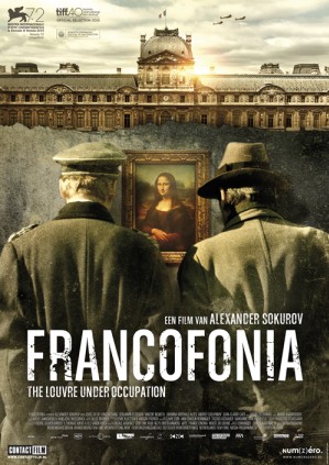
Today's Review: Francofonia


The second review by my hand posted on FilmTotaal this year (but more is well underway!):

Francofonia - recensie

This is an intriguing compendium piece to Sokurov's breakthrough film Russian Ark, though it lacks the stylistic punch of that particular film. Of course, doing another 100-minute one-take shot would have felt repetitive, as if the director attempted to capitalize on his own past glory. So there's none of that in Francofonia, but that's not to stop Sokurov from pulling a few more cinematographic tricks out of his hat. That, and the overall message, matters more to him than following conventional narrative expectations. Which is made clear a bit painfully, as Francofonia is literally all over the Louvre, rather than sticking to the single time frame that one would have expected to be the primary focus. Even though the museum's survival of the war years during WW II appears to be the subject at hand, Sokurov has a lot more to tell about the place's long history, not to mention sharing his personal thoughts on both the Louvre's background, its place in art history and the treatment of art in general. That's a lot to tackle for a 90-minute movie...

And of course, as a result, not every episode of the Louvre's story proves as interesting. In fact, all of the film suffers from Sokurovs tendency to change subjects, drone on about the abuse and capitalization of art works and sudden jumps to different time periods. Nevertheless, the message remains clear: museums should not be reduced to pawns of commerce, politics or dictators. They are time capsules that tell all of human history and should be carefully preserved, kept well away from the power hungry. The German occupation is just an example of and an hommage to a period in history where the joining of forces between two like minded men, who by all accounts ought to be diametrically opposed, preserved countless artifacts for posterity. Sokurov thanks both men for their assistance to cultural history. But he also isn't afraid to remind us that the origin of the Louvre itself is steeped in conquest and theft. After all, the emperor Napoleon captured many pieces of art on his campaigns abroad and had them shipped to the capital of his empire. Hitler simply attempted to do the same and failed in the Louvre's case, while succeeding in a lot of other cases. Art and politics certainly aren't mutually exclusive.


It's a point Sokurovs makes with the help of various stylistic choices, some proven in prior works, others applied for the first time in his case. Though there are no excessively long takes used as there were in Russian Ark, his introduction of historical characters sharing their insights and motivations with us is taken straight from that film. In this case restricted to only two characters (Marianne, the French Spirit of Freedom and Napoleon), rather than many. This is not a coincidence of course, as Francofonia's main tale also deals with two characters, the museum director (representing the side of French freedom) and the Nazi officer (the conquering party, the Napoleonic figure). Their story is intercut with historical footage, while it is itself disguised as historical footage by its old fashioned framing and the many print scratches applied. It would have worked even better if it was in black and white, but apparently Sokurov disagreed. He disagrees with a lot of things in Francofonia. Like art being shipped over seas as any other piece of cargo in containers on large freighters, its very existence threatened by a violent storm. Why does art suffer so much indignity and indifference today, he laments. No matter how fragmented his thoughts as shown in Francofonia, it's hard to disagree with him, when ancient buildings and statues are demolished left and right by zealous barbarians, who are also eager to simply sell such cultural heritage to the highest bidder to fund their cause. World War II may have ended seventy years ago, but art remains ever in danger at the hands of subversive ideologies. Francofonia serves as an cautionary reminder of what could be scrapped from the history pages forever if we are not careful and respectful of art's place in our cultural mind.

maandag 1 februari 2016

Jurassic Park: Dinosaurs 2: Velociraptor/Spinosaurus 2-pack


Year of release: 2004

Description: the small Spinosaurus figure stands in a walking posture, with its left leg posed forward and the left arm raised, its mouth opened as if roaring and the end of the tail bent pointing to the right. Its underside (throat, belly and inward part of the upper legs) is painted light brown, while the same colour is found on its back below the sail and the front top half of the tail, as well as above the eyes (like eye brows) and on the snout. The rest of the body is coloured regular brown, while the sail is painted dark brown. On either side of the creature, two pairs of black stripes are found, one pair on the flanks and another on the upper legs. The claws on the feet are painted black, but the claws on the hands are unpainted. The edges of the mouth are black, while the animal has white teeth and a dark pink (almost brown in fact) tongue and inside of the mouth. The figure has very small yellow eyes with black pupils, and carries a white JP logo on its right upper leg.
The Velociraptor stands in a stalking pose, its right arm and leg stretched outward and its head raised upwards with its mouth open, as if it means to jump on something. The tail is raised upwards and bent at the tip. Most of the body is coloured very light green (almost beige) except for the lower legs and feet, most of the head (except for the ocular area and underside of the lower jaw) and the back, which are coloured reddish brown. On its back, this brown colouring runs over the upper arms and legs and flanks in triangular shapes. The very middle of the brown section on the back is painted yellow, which also forms similar shapes running over the brown triangular colouring. The claws on the feet are painted in the same yellow, but the claws on its hands are not painted. The figure's underside (throat and belly) is coloured in a very vague different hue of light green, and may actually be called beige when inspecting it very closely. The Raptor has yellow eyes with cat like black pupils and black eye liner, while the edges around its mouth are also black, and the creature sports white teeth and a dark pink tongue and inside of the mouth. The figure carries a black JP logo on its left upper leg.


Analysis: and so the infinite repainting of smaller dinosaur figures kicks into full gear, after having been introduced moderately in JP III Camo-Xtreme. These dinosaur 2-packs offer very little besides the occasional imaginative paint jobs, except for the chance to create huge armies of identical dinosaur sculpts. Why anyone would want that is a good question. Creating armies of Imperial troops from Hasbro's Star Wars lines is not unusual, since such figures usually stand in a neutral pose and they all look alike any way. But having twenty figures of the same species in the exact same attack posture, except with totally different paint jobs, makes little sense at all.
In the case of the Velociraptor/Spinosaurus 2-pack the paint jobs are at least okay. In fact, the Raptor paint job is actually quite good. The double claw like pattern on its back underscores its aggressive nature, attack posture and its own big claws. Such appeal is not to be found in the Spinosaurus, which looks a bit dull by comparison, but not a total loss either. Something more original for the sail would have been welcome. Also a real shame the claws on the hands of both creatures have been omitted, since the detailing of both figures is otherwise fairly good.
The Raptor, which in normal circumstances would be more or less in scale with Hasbro's human figures (though not in the standard JP situation where Velociraptors are hugely oversized), is lucky he's almost as big as the Spinosaurus. In reality any Spinosaurus would just bite the Raptor in half. In a fight between these two dinosaurs, the Raptor with its lethal sickle shaped claws would probably win the day.

Repaint: yes. Both figures are repaints of dinosaurs that originally came with human figures for the JP III line. The Velociraptor was paired with Alan Grant, while the Spinosaurus belonged to Amanda Kirby. Both figures have been repainted before for JP III Camo-Xtreme, and would be repainted several times again for this line, JPD3 and JP 2009.

Overall rating: 6/10. There's nothing novel to both sculpts, but these new paint jobs are adequate and certainly not as bad as some of the repaints to follow. Like most dinosaur two-packs from JPD2 and JPD3, this is one of the more common releases and it can still be found without trouble, usually for low prices because they're not in high demand (for obvious reasons).

zondag 24 januari 2016

Oscars 2016: The Predictions


It's late January, so it's time for another round of predicting who will and won't go home with one (or more) of them little gold statuettes. Based on uncanny prior experience deducting winners, in-depth knowledge of the Academy's politics and personal acquantaince with all its members, I should get a lot of these right. Too bad I have little of the above, I'm just a guy with a gut feeling and an opinion, coupled with above average knowledge of movies and stuff. So there's bound to be a few misses here, but then, the Academy sadly never asks what I think. 


Best Film:
First Choice: I wanna say Mad Max: Fury Road, since that's the film I thought best of all the movies nominated I've seen. Which is less than half of them, admittedly. Gimme a break, the other half hasn't even been released here yet! I plan on seeing the rest ASAP. That being the case, I have a hunch it's gonna be The Revenant.
Second choice: The Big Short. Because Inarritu already won Best Picture only last year, so it wouldn't be fair to the others. Mind you, a lot of black people will remind you fairness is not something the Academy takes into account...

Best Actor:
First Choice: Leonardo DiCaprio. Nominated six times before. So don't you think it's about time as much as 'about time' can get?
Second choice: Michael Fassbender. Even though he didn't look much like Steve Jobs physically, he certainly got the rest right to make for a memorable performance.
 
Best Actress:
First Choice: Cate Blanchett. Because, you know... Cate Blanchett!
Second choice: Brie Larson. For getting stuck in a room and acting her way out.


Best Supporting Actor: 
First Choice: Christian Bale. Another hunch, but I'm not that impressed by this batch of candidates.
Second choice: Mark Rylance. Such a sweet, mild mannered performance. For a spy hellbent on destroying the US of A and the assorted freedom that goes with it. But still we like him.

Best Supporting Actress:
First Choice: Rooney Mara. Because I like to think Cate Blanchett's talent is highly inspirational. Getting intimate with her increases the acting capabilities of others, perhaps? Not to say Mara was no good prior to meeting Cate. Far from it in fact.
Second choice: Rachel McAdams. Because I've seen the other options on the big screen and I can't pick.


Best Director:
First Choice: George Miller. Because I want him to win, not because I think he actually will. Anybody capable of crafting such an insanely fantastic world at his advanced age and getting embraced by audiences and critics alike deserves to win.
Second choice: Adam McKay. A more likely scenario.


Best Screenplay:
First Choice: Spotlight. Seems the least unlikely candidate.
Second choice: Inside Out. It's gonna win Best Animated Feature for sure, but it quite deserves this one as well.

Best Adapted Screenplay:
First Choice: The Big Short. Because it's so highly intelligent and complicated. Oh no, it isn't, that's just what Wall Street wants you to think so nobody asks them the hard questions and they keep getting away with the shit they pull. And that's exactly what this script makes painfully clear.
Second choice: The Martian. A hunch. And because science is fun again.

Best Animated Film:
First Choice: Inside Out. Duh.
Second choice: I wanna say Shaun the Sheep, because I almost cried, but reason makes me say Anomalisa. Because it's unlike most animated features getting this nomination. It's not for kids, for one thing. So that makes it a different thing which deserves a chance to shine. But Inside Out is gonna take its glory, make no mistake.

Best Foreign Film:
First Choice: Son of Saul (Saul Fia). No competition.
Second choice: El Abrazo de la Serpiente. Still, no competition though.

Best Cinematography:
First Choice: This one is really hard. All contenders have very bold, innovative cinematography.  Sicario and Mad Max: Fury Road sure impressed me, but I think it's gonna be The Hateful Eight.
Second choice: Sicario. Because it's kinda the underdog here, and everybody loves an underdog.
EDIT: Fuck that, it's gonna be The Revenant, too!


Best Editing: 
First Choice: Competition is not as strong here. The Revenant.
Second choice: Mad Max: Fury Road.

Best Production Design:
First Choice: Mad Max: Fury Road. If you've seen it, you know full well why. Crazy production design for an insane world.
Second choice: The Martian.

Best Costume Design:
First Choice: Cinderella. Lavish got a new dimension. In 3D.
Second choice: Mad Max: Fury Road. Again, crazy.

Best Hair and Make-up:
First Choice: Mad Max: Fury Road. It's becoming my mantra in the technical department, but I just have strong faith in it.
Second choice: The Revenant. That's that handsome Leonardo DiCaprio fella under all that mud and blood, you know?

Best Score:
First Choice: The Hateful Eight. Same reason as Leo: it's high time after six snubs. Plus, he has been a master at his work for decades and this score was just totally brilliant. More so than the movie itself in fact.
Second choice: Sicario. Because it scared me, which it was supposed to.

Best Song:
First Choice: Spectre. Because the writing's on the wall. I didn't much care for it at first to be honest, but it really grew on me.
Second choice: whatever. Youth.


Best Sound Mixing:
First Choice: Mad Max: Fury Road, same as before.
Second choice: Star Wars: The Force Awakens.

Best Sound Editing: 
First Choice: Star Wars: The Force Awakens actually. The soundscape of Star Wars is a universe on its own even now another has taken over, and at least one sound award should acknowledge that fact.
Second choice: Mad Max: Fury Road.

Best Visual Effects:
First Choice: Ex Machina. For being subtle and not drawing attention to itself, but still totally believable. For those who didn't know, Alicia Vikander doesn't actually look like that in real life, that's all VFX.
Second choice: Mad Max: Fury Road. Because of that whole Mad Max thing I got going here, in case you missed it.

Best Documentary: 
First Choice: The Look of Silence. Can't go wrong with Indonesian genocide. Part 2.
Second choice: Amy. Because it appeals to the masses more than Ukrain, Nina Simone or drug cartels.


Februay 28th will tell me how right, or rather, how wrong, I am. What a lovely day!

donderdag 21 januari 2016

Today's Review: Sneekweek


Another week, another review:

Sneekweek - Recensie

Expectations weren't high, and with good reason it turns out. Dutch movies usually aren't great to begin with, but Dutch movies emulating popular American films are often worse. In this case, it's Scream that's being "hommaged". This is a horror comedy made by people who obviously love horror films and have seen their fair share of them. But they've never actually made one before, and it shows.

The plot starts out oh so conventional. A bunch of students accidentally get someone killed in a silly game and do the dumbest thing imaginable (which is usual in this genre): they cover it up and try to forget about it. It obviously doesn't work, and when we catch up with them two years later, the recently graduated college kids turn out to be using not only the fun type of drugs to cope with their shady past. The standard horror trope archetypes are applied to these characters, the likes we've seen a thousand times before. The fact they spend most of the movie either bickering or engaging in supposed sexy slang doesn't make us care at all for them, we just want to see them die horribly fast. For that, the movie certainly takes its time. The masked killer soon stalks the premises of their backwood residence - insofar there are any backwoods in Friesland - but it takes quite a while before people really start dying. Meanwhile, our patience is tested when the kids argue their way from one party to the other, accompanied by obnoxiously loud techno music. To appeal to the modern generation I guess.


And then the second half of Sneekweek arrives. All bets are off as to the identity of the killer. It's not as obvious as you might think. In fact, it's not considerably complicated either, the movie just feels like making it so by twisting things around to such an extent that everybody is suspect. The kills pick up pace rapidly, but leave a lot to be desired in terms of originality or scariness. Not to mention in terms of looking convincing, which they don't. The story quickly turns equally messy, until the final reveal which feels like a big letdown. At least the comedy starts kicking in by providing a few good laughs to horror aficionados, including a memorable oneliner or two. These obviously reference the genre more than they do the movie itself, as is the Sneekweek's intent. The movie's whole set-up is one big reference to the genre, playing with conventions and adding narrative surprises by making things seem different than they are based on what you expect from a slasher movie. Thing is, this sort of film is hardly novel by now. In fact, Sneekweek's prime example Scream is already 20 years old by now, and has been referenced so often that making similarly selfreflexive films has become a horror staple itself.

Sneekweek hardly innovates. It does surprise from a narrative stance, but not in a satisfactory way. The movie desperately tries not to adhere to our expectations, and thus ends up confusing audiences more than frightening them. Unless they didn't see Scream or any similar self referential slasher films these past two decades. Considering the movie seems to focus on an audience of 16 to 18 year olds with its young cast and irritating soundtrack, there's bound to be a few people who feel this horror movie was original. Whether they'll enjoy it remains another question.